Kunde: Aider
Byrå: Bly
Nettside: Ståle Hevrøy/Bly
Foto, kontor: Jo Bergersen, Fjuz
Leveranse: Visuell identitet, designsystem, interiørkonsept, skilting og annen implementering
Byrå: Bly
Nettside: Ståle Hevrøy/Bly
Foto, kontor: Jo Bergersen, Fjuz
Leveranse: Visuell identitet, designsystem, interiørkonsept, skilting og annen implementering
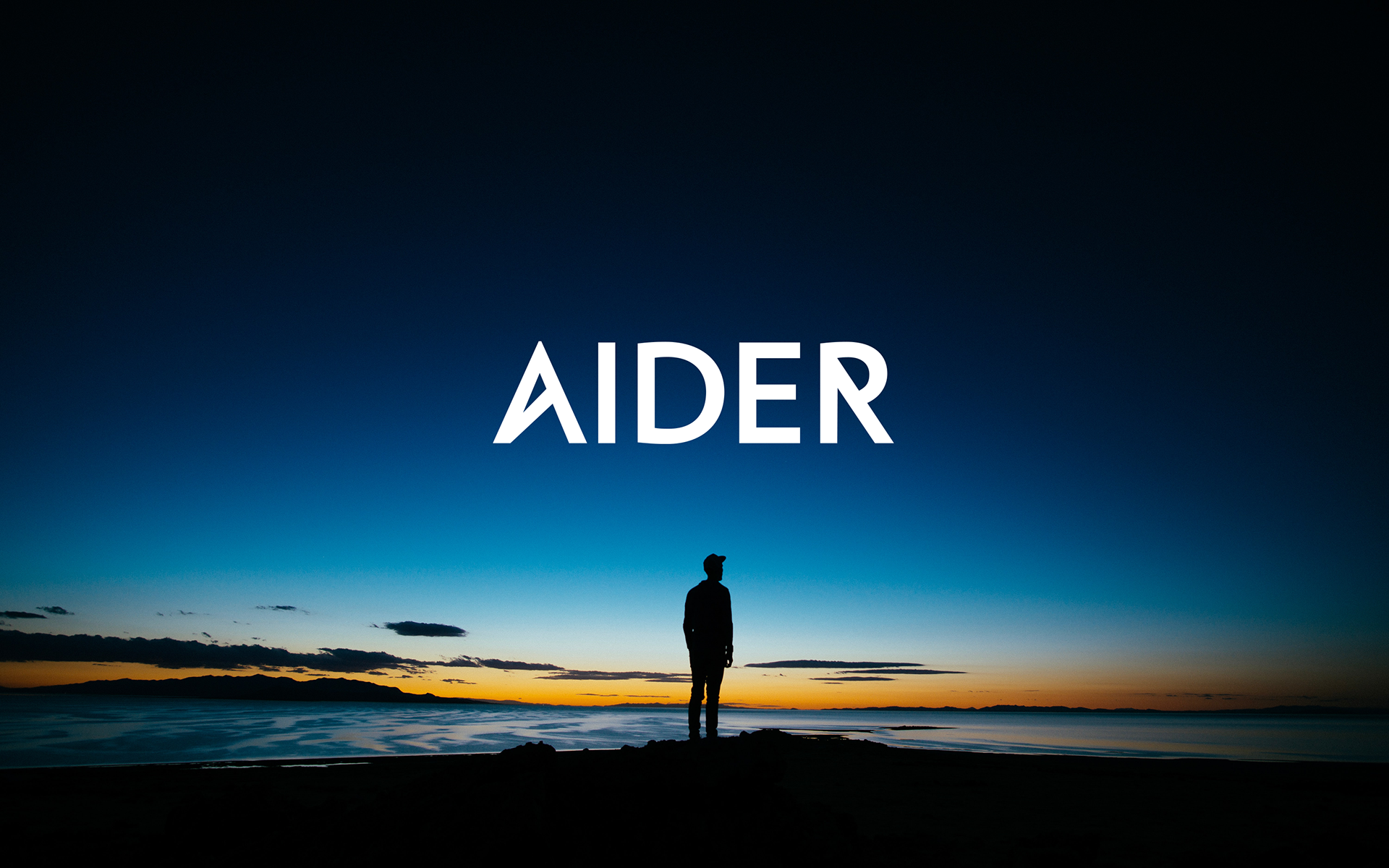
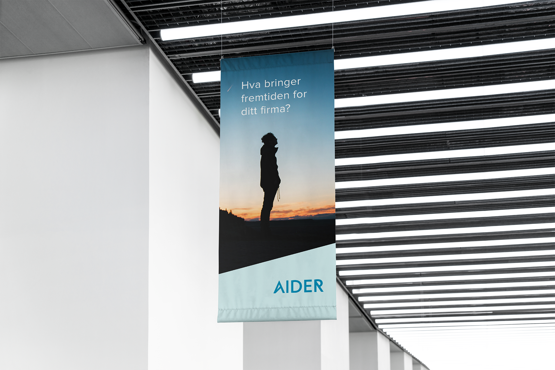
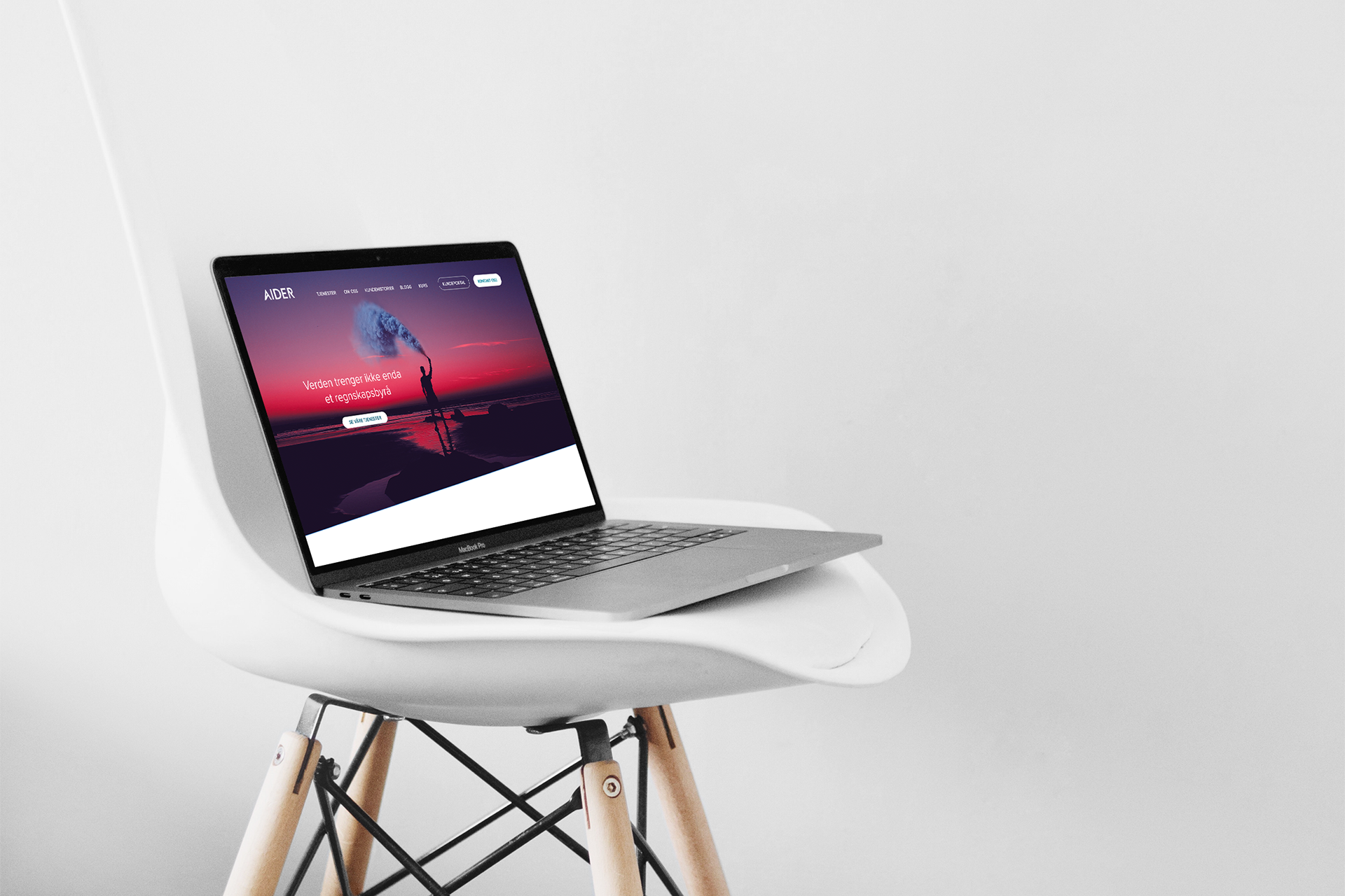
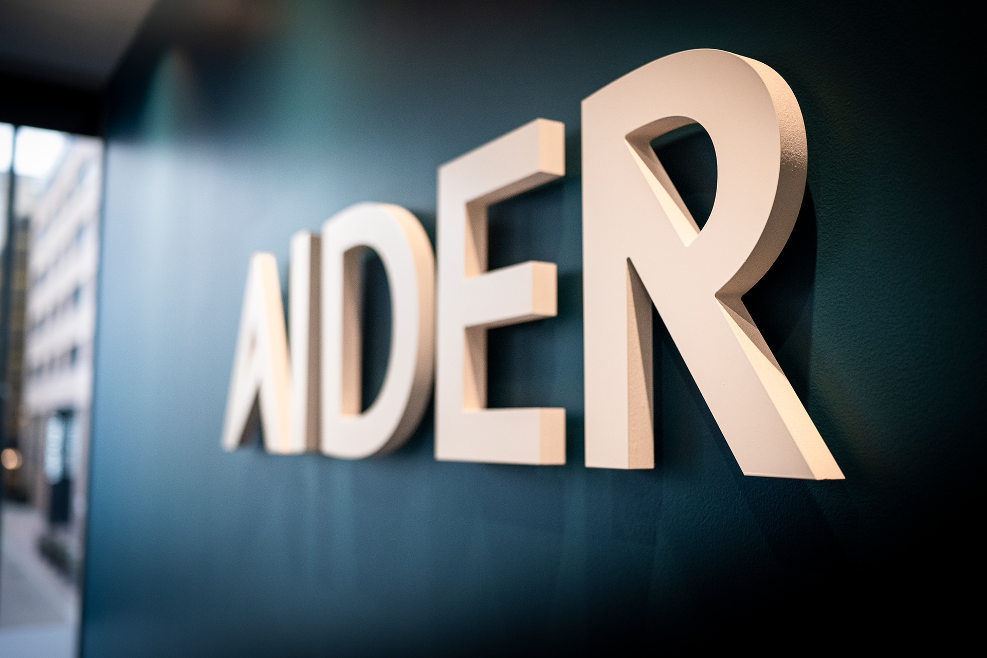
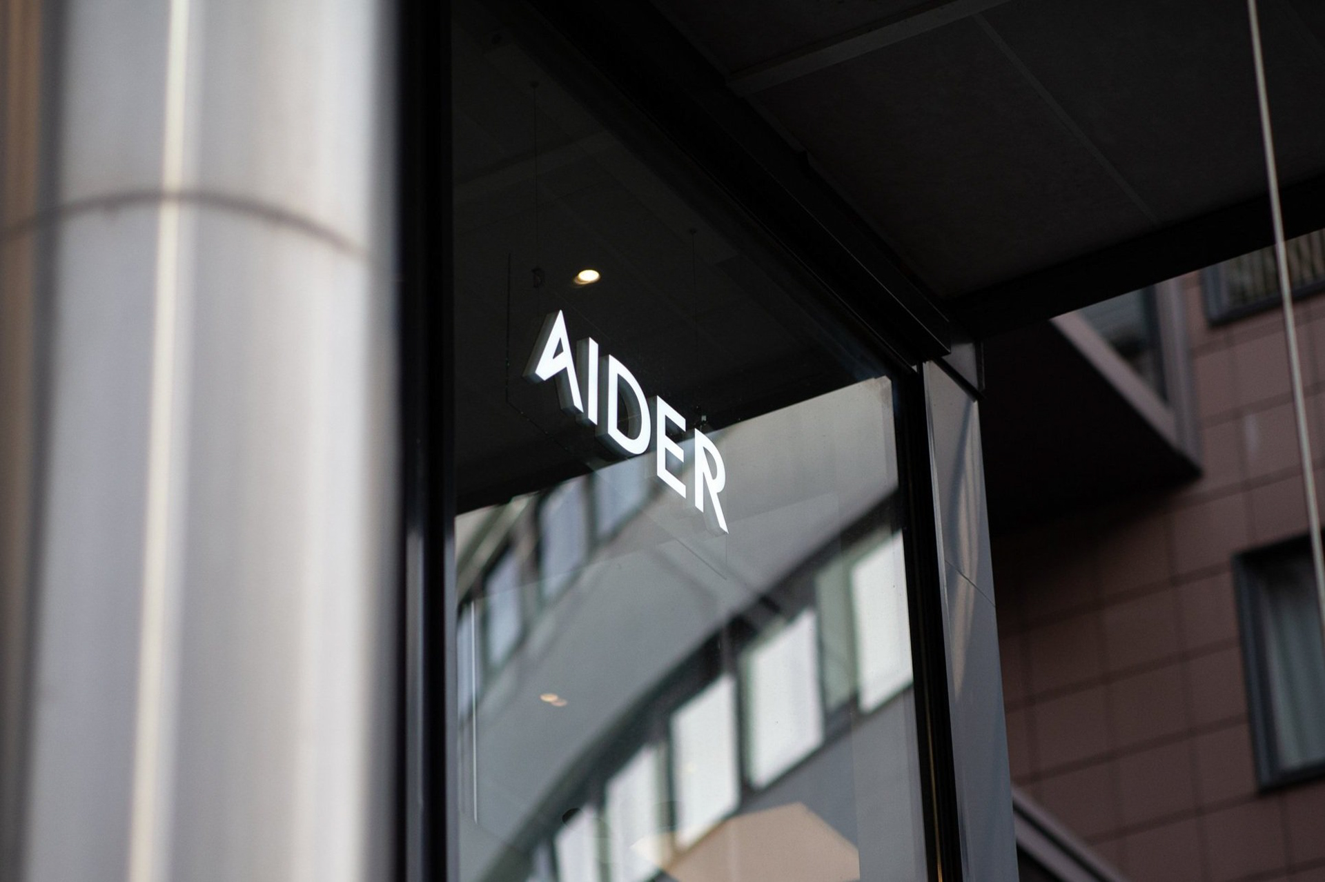
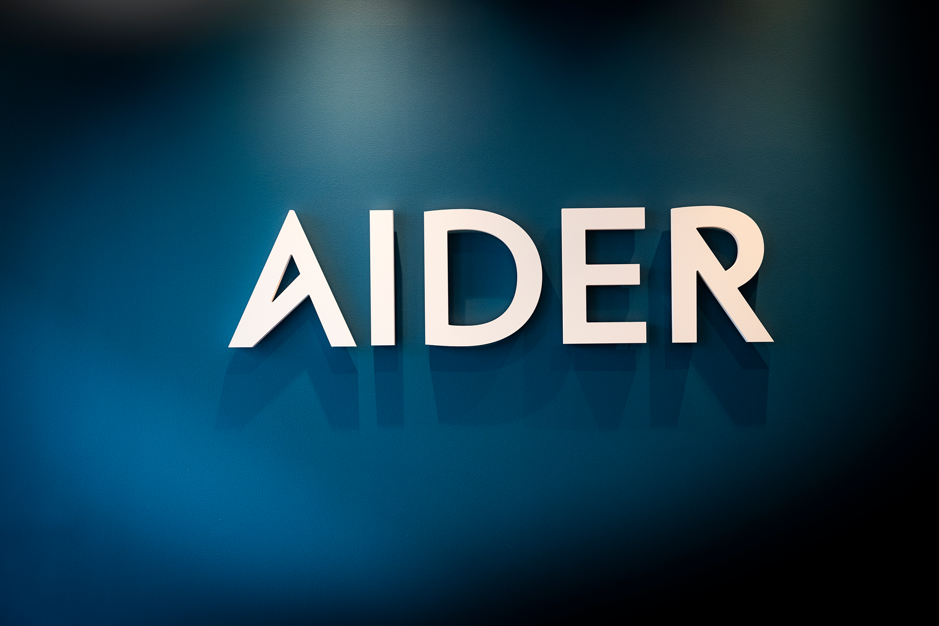
Regnskapsbyrået Aider har fått navnet sitt fra fjellklatringsutstyr med samme navn, som er til hjelp for klatrere. Navnet er et metafor for hjelpen Aider gir kundene sine med regnskap og administrasjon i hverdagen. A-en i logoen har et subtilt hint til en fjelltopp og historien bak navnet.
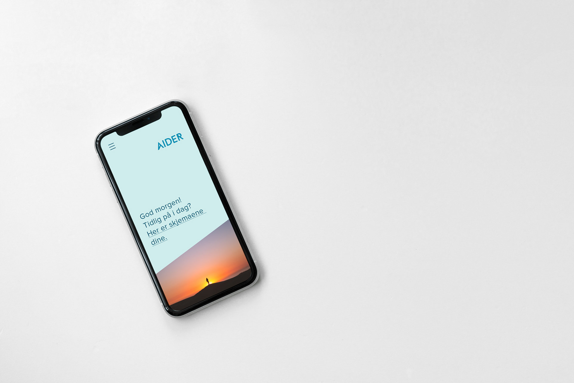
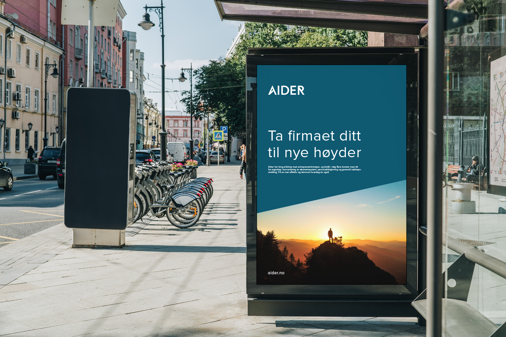
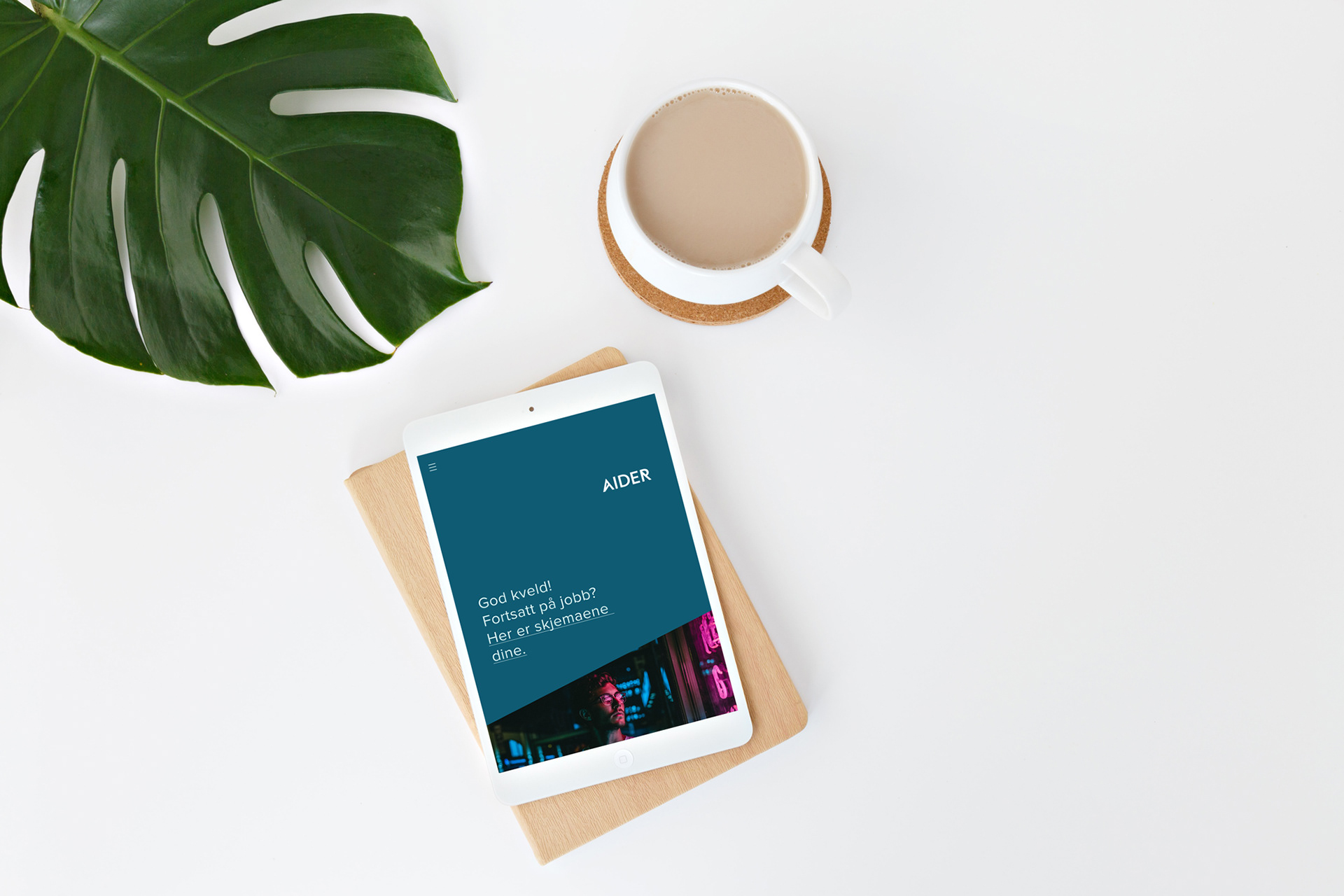
Aider fokuserer på å forenkle og digitalisere regnskapsføring, noe som gir regnskapsførerne mer til til å rådgi kundene sine. Den visuelle identiteten er derfor ren og enkel for å understreke dette. Bildestilen fokuserer på mennesker med store visjoner som ser inn i fremtiden. Den diagonale formen visualiserer vekst.